

Spectral Display
If the spectral mode is selected in the menu, it takes some seconds to calculate a frequency spectrum for the displayed range. The Y axis will be used for different frequencies, at the bottom the low frequencies are displayed and at the top the high frequencies (up to 22.5 kHz which is the maximum frequency you can archive with a 44.1 kHz sample rate). Further the color of a point describe the amplitude of each frequency band. If there are discontinuties in this view, there is sometimes something wrong in the wave.
Advertisement / Anzeige
This kind of display has some advantages. E.g. pops are much more easily found, as an example see the next picture.
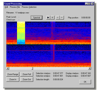
In this example have a look at the mid of the shown range. There are some red spikes which show a distortion in the audio for a very short period of time. Before and afterwards sound is all quite the same, only that single position stands out. It is more than probable that this defect is audible. Play that range and listen carefully to determine how bad it really is.
Advertisement / Anzeige
The yellow selected range is a special selection mode on the spectral display. In sample selection mode, only one sample is selected, but in spectral display this one sample has effects to quite a range of the spectral display. This is why the selection cursor is at least a specific size. If you learned how to use it correctly, it can be of great help finding these positions in the sample display.


